Network Graph Visualizations
Graph drawing or network diagram is a pictorial representation of the vertices and edges of a graph. This drawing should not be confused with the graph itself, very different layouts can correspond to the same graph. In the abstract, all that matters is which pairs of vertices are connected by edges. In the concrete, however, the arrangement of these vertices and edges within a drawing affects its understandability, usability, fabrication cost, and aesthetics.
The problem gets worse, if the graph changes over time by adding and deleting edges (dynamic graph drawing) and the goal is to preserve the user’s mental map.
Arc Diagram
An arc diagram is a style of graph drawing, in which the vertices of a graph are placed along a line in the Euclidean plane, with edges being drawn as semicircles in one of the two halfplanes bounded by the line, or as smooth curves formed by sequences of semicircles. In some cases, line segments of the line itself are also allowed as edges, as long as they connect only vertices that are consecutive along the line.
The use of the phrase arc diagram for this kind of drawings follows the use of a similar type of diagram by Wattenberg (2002) to visualize the repetition patterns in strings, by using arcs to connect pairs of equal substrings. However, this style of graph drawing is much older than its name, dating back to the work of Saaty (1964) and Nicholson (1968), who used arc diagrams to study crossing numbers of graphs. An older but less frequently used name for arc diagrams is linear embeddings.
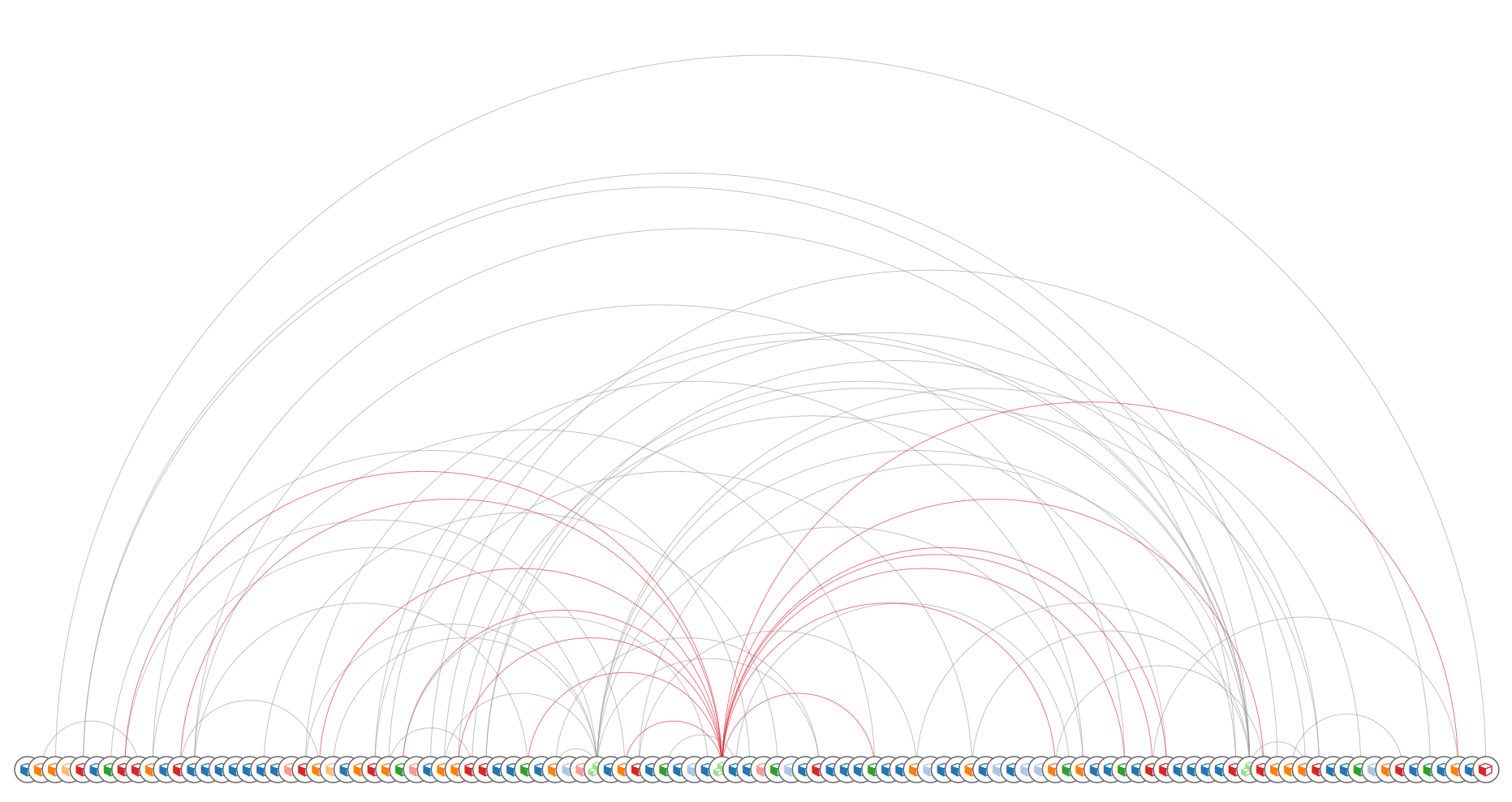
OpenStack project resources in Arc diagram (cca 100 resources)
Heer, Bostock & Ogievetsky wrote that arc diagrams “may not convey the overall structure of the graph as effectively as a two-dimensional layout”, but that their layout makes it easy to display multivariate data associated with the vertices of the graph.
References
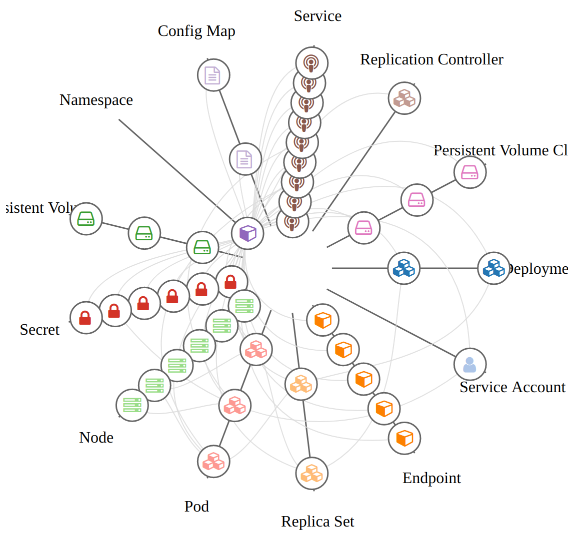
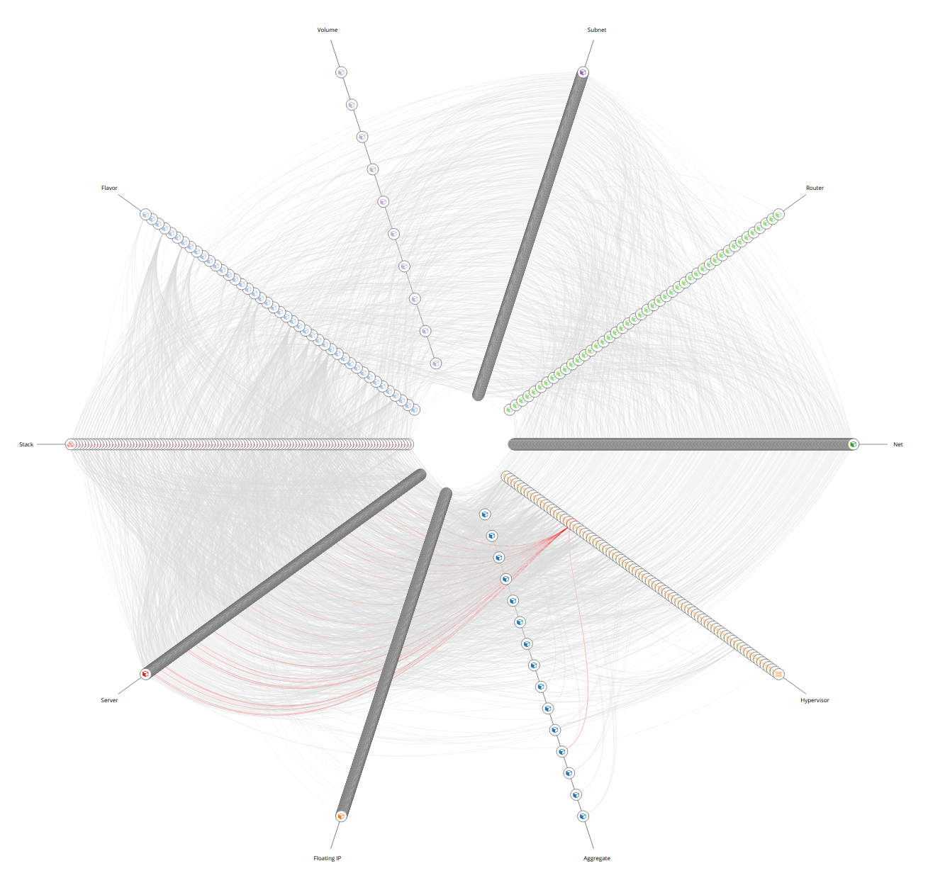
Force-Directed Graph
A Force-directed graph drawing algorithms are used for drawing graphs in an aesthetically pleasing way. Their purpose is to position the nodes of a graph in two-dimensional or three-dimensional space so that all the edges are of more or less equal length and there are as few crossing edges as possible, by assigning forces among the set of edges and the set of nodes, based on their relative positions, and then using these forces either to simulate the motion of the edges and nodes or to minimize their energy.
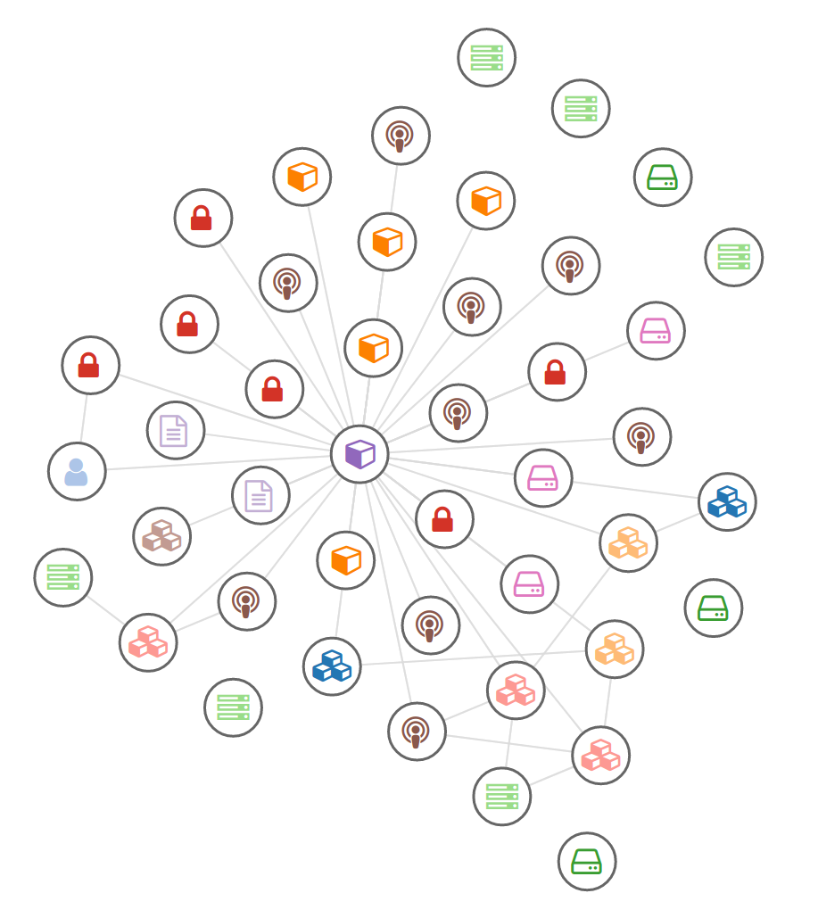
Kubernetes cluster in Force-directed graph
While graph drawing can be a difficult problem, force-directed algorithms, being physical simulations, usually require no special knowledge about graph theory such as planarity.
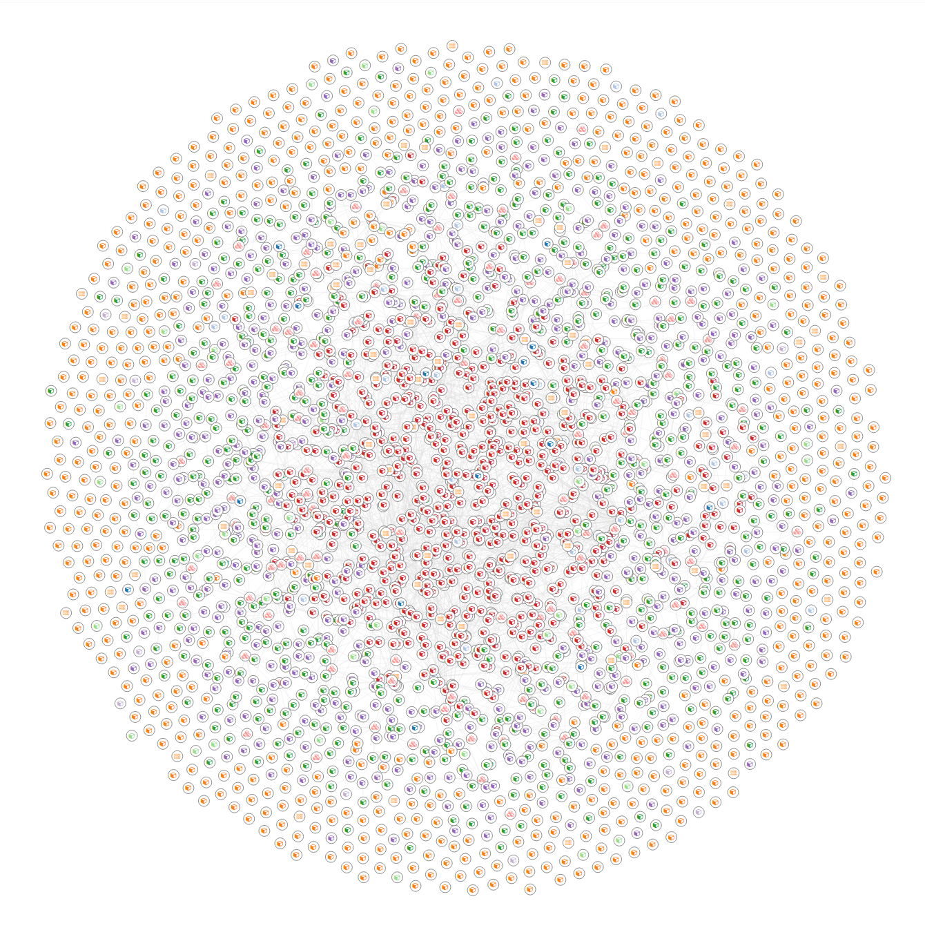
Whole OpenStack cloud in Force-directed graph (cca 3000 resources)
Good-quality results can be achieved for graphs of medium size (up to 50–500 vertices), the results obtained have usually very good results based on the following criteria: uniform edge length, uniform vertex distribution and showing symmetry. This last criterion is among the most important ones and is hard to achieve with any other type of algorithm.
References
- https://en.wikipedia.org/wiki/Force-directed_graph_drawing
- https://bl.ocks.org/shimizu/e6209de87cdddde38dadbb746feaf3a3 shimizu’s D3 v4 - force layout
- https://bl.ocks.org/mbostock/3750558 Mike Bostock’s Sticky Force Layout
- https://bl.ocks.org/emeeks/302096884d5fbc1817062492605b50dd D3v4 Constraint-Based Layout
- http://bl.ocks.org/biovisualize/5801758 dag layout
- http://bl.ocks.org/bobbydavid/5841683 DAG visualization
- https://bl.ocks.org/emeeks/302096884d5fbc1817062492605b50dd D3v4 Constraint-Based Layout
- https://bl.ocks.org/denisemauldin/cdd667cbaf7b45d600a634c8ae32fae5 Filtering Nodes on Force-Directed Graphs (D3 V4)
Hierarchical Edge Bundling
A hierarchical edge bundling is a new method for visualizing such compound graphs. Our approach is based on visually bundling the adjacency edges, i.e., non-hierarchical edges, together. We realize this as follows. We assume that the hierarchy is shown via a standard tree visualization method. Next, we bend each adjacency edge, modeled as a B-spline curve, toward the polyline defined by the path via the inclusion edges from one node to another.
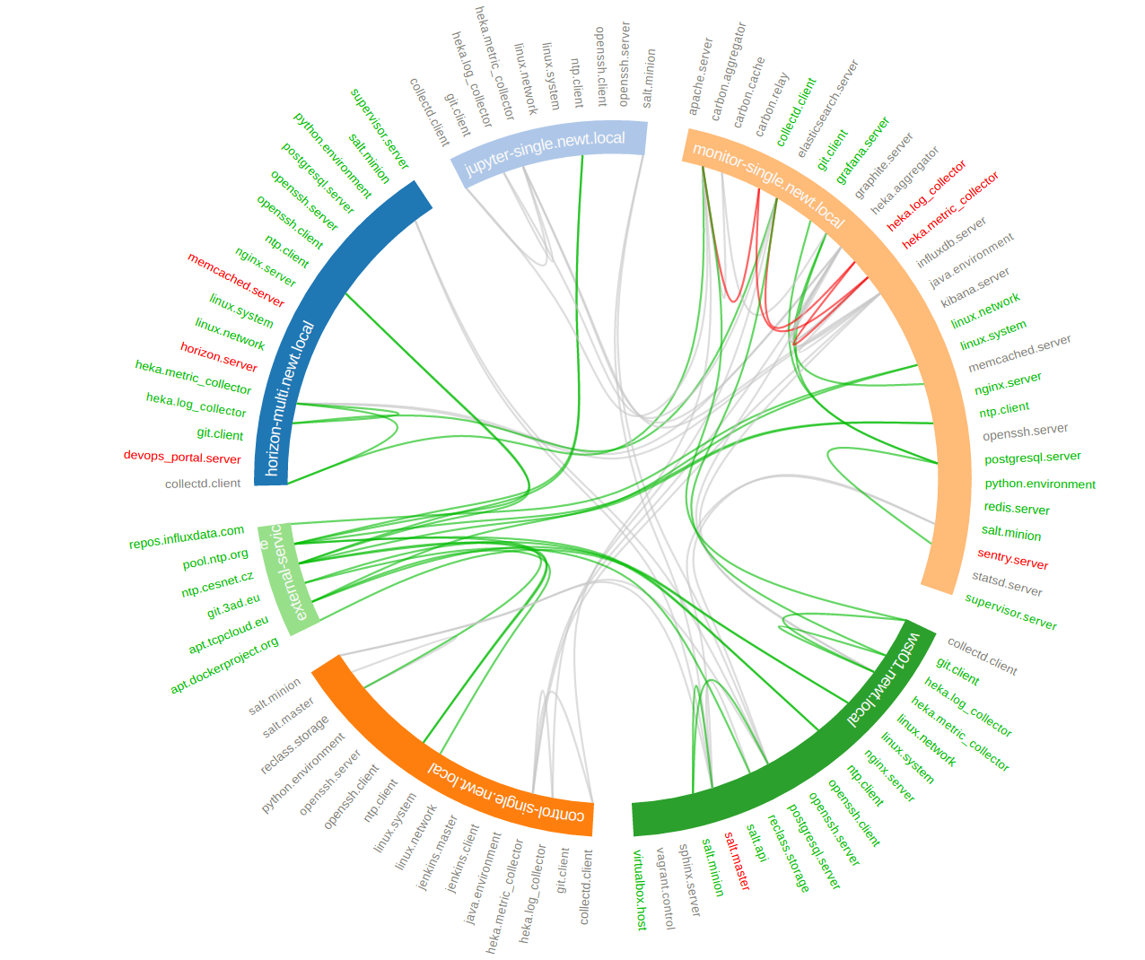
Hierarchical edge bundling of SaltStack services and their relations (cca 100 nodes)
This hierarchical bundling reduces visual clutter and also visualizes implicit adjacency edges between parent nodes that are the result of explicit adjacency edges between their respective child nodes. Furthermore, hierarchical edge bundling is a generic method which can be used in conjunction with existing tree visualization techniques.
Hive Plot
The hive plot is a visualization method for drawing networks. Nodes are mapped to and positioned on radially distributed linear axes — this mapping is based on network structural properties. Edges are drawn as curved links. Simple and interpretable.
Kubernetes cluster in Hive plot
The purpose of the hive plot is to establish a new baseline for visualization of large networks — a method that is both general and tunable and useful as a starting point in visually exploring network structure.
Whole OpenStack cloud in Hive plot (cca 10 000 resources)
Adjacency Matrix
An adjacency matrix is a square matrix used to represent a finite graph. The elements of the matrix indicate whether pairs of vertices are adjacent or not in the graph.
In the special case of a finite simple graph, the adjacency matrix is a (0,1)-matrix with zeros on its diagonal. If the graph is undirected, the adjacency matrix is symmetric. The relationship between a graph and the eigenvalues and eigenvectors of its adjacency matrix is studied in spectral graph theory.
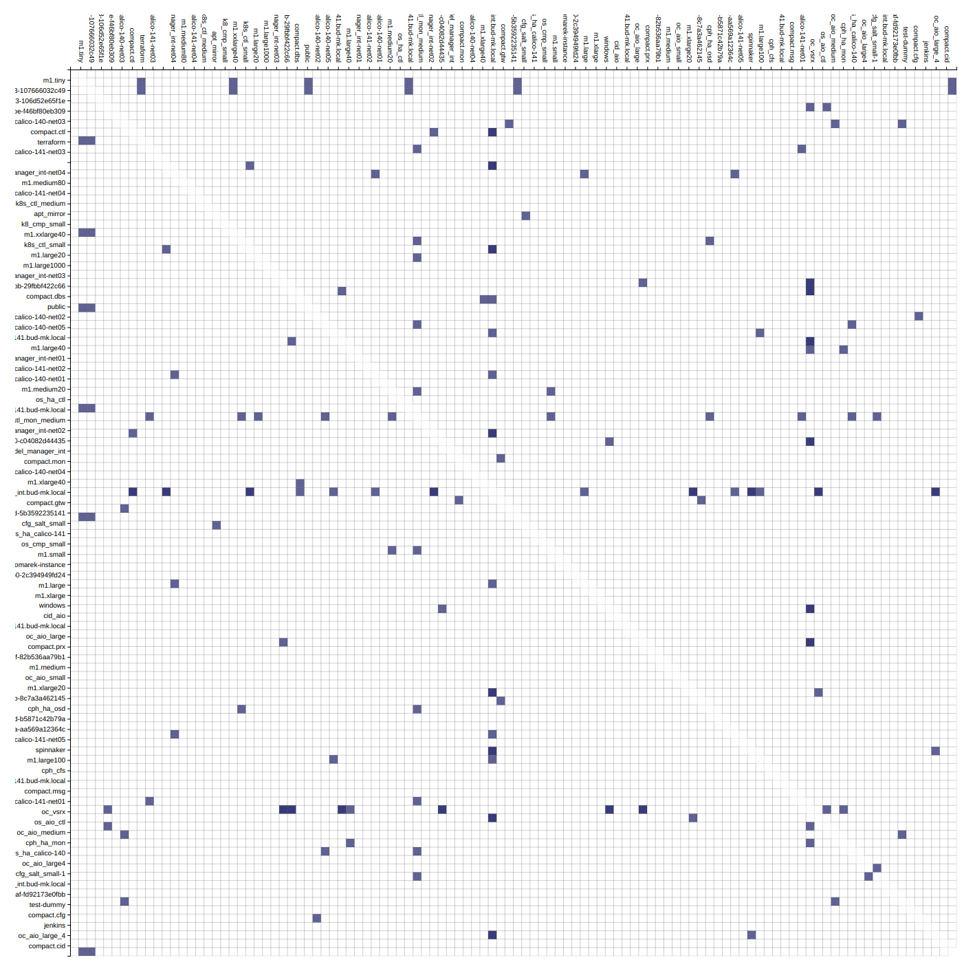
Adjacency matrix of OpenStack project’s resources (cca 100 nodes)
The adjacency matrix should be distinguished from the incidence matrix for a graph, a different matrix representation whose elements indicate whether vertex–edge pairs are incident or not, and degree matrix which contains information about the degree of each vertex.
References
Sankey Diagram
Sankey diagrams are a specific type of flow diagram, in which the width of the arrows is shown proportionally to the flow quantity. Sankey diagrams put a visual emphasis on the major transfers or flows within a system. They are helpful in locating dominant contributions to an overall flow. Often, Sankey diagrams show conserved quantities within defined system boundaries.
Sankey diagrams are named after Irish Captain Matthew Henry Phineas Riall Sankey, who used this type of diagram in 1898 in a classic figure (see panel on the right) showing the energy efficiency of a steam engine. While the first charts in black and white were merely used to display one type of flow (e.g. steam), using colors for different types of flows has added more degrees of freedom to Sankey diagrams.
One of the most famous Sankey diagrams is Charles Minard’s Map of Napoleon’s Russian Campaign of 1812. It is a flow map, overlaying a Sankey diagram onto a geographical map. It was created in 1869, so it actually predates Sankey’s ‘first’ Sankey diagram of 1898.
References
Alluvial Diagram
Alluvial diagrams are a type of flow diagram originally developed to represent changes in network structure over time. In allusion to both their visual appearance and their emphasis on flow, alluvial diagrams are named after alluvial fans that are naturally formed by the soil deposited from streaming water.